Duplex in golden colorado
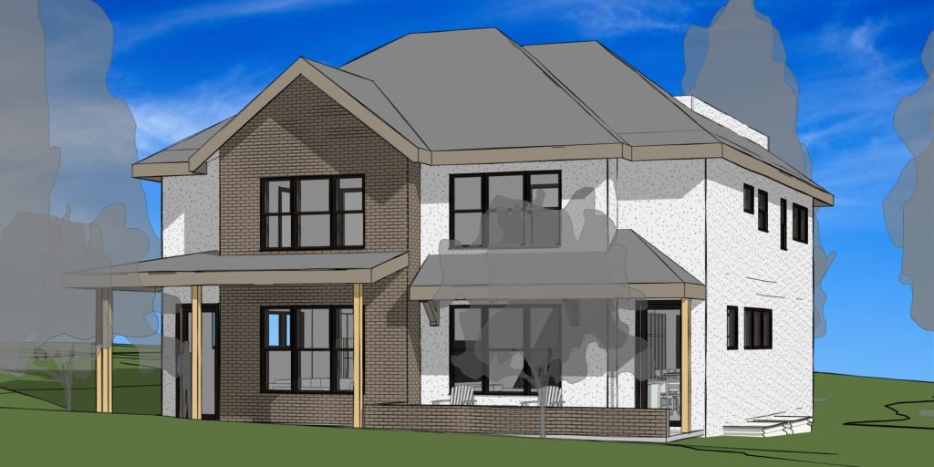
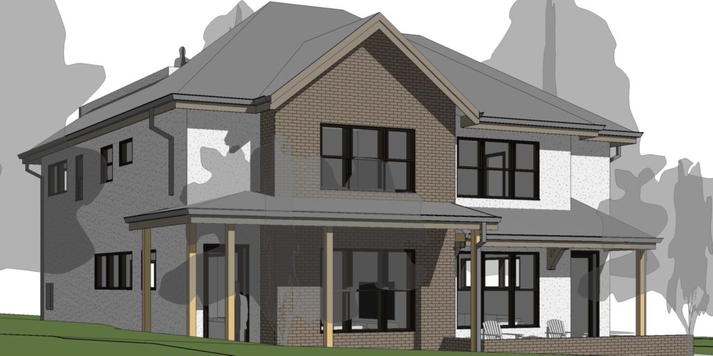
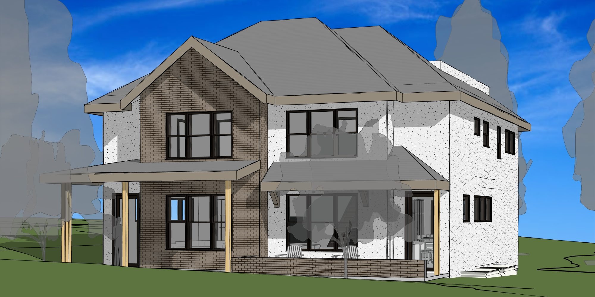
This duplex in Golden, Colorado is situated on an in-fill property. The lot is 50′ wide and 140′ long. There is alley access. This duplex is in a predominantly single family neighborhood. Therefore we designed the building to fit in this context. The exterior is asymmetrical. The building materials and forms are responsive to the neighborhood context.
The program for this duplex is open concept on the main floor. The project brief calls for two bedrooms upstairs with en suite baths. The laundry room is on this level. The stairs continue to a roof top patio. This patio is screened from view at the street site. Downstairs has 2 more bedrooms and a media room.

responsive design
In addition to responding to the local context. We also designed the Duplex in Golden, Colorado to be responsive to the environment. This is achieved by incorporating green design components. Golden provides a useful sustainability menu.
This sustainability menu has four categories of green features. The first is water conservation. For this category we used xeriscaping, efficient irrigation, rain sensors, porous surfaces, and EPA certified fixtures.
The second category is energy conservation. In this section we have efficient heating and cooling systems. These are for hot water and air temperature comfort. We also include sealed, insulated ductwork, and enhanced insulation. This is to reduce energy usage and therefore bills.
The third category consists of materials and resources. Efficient framing techniques were implemented. This reduces the amount of lumber and labor required.
The forth category is innovation. This project does not have any additional points here. Overall we provided a greater number of points than suggested.

considerations for an open plan concept
We designed this Duplex in Golden, Colorado with an open main floor concept. Open floor concepts can be difficult. However, our design approach mitigates these difficulties. We create pathways, rooms, and views with minimal disruption.
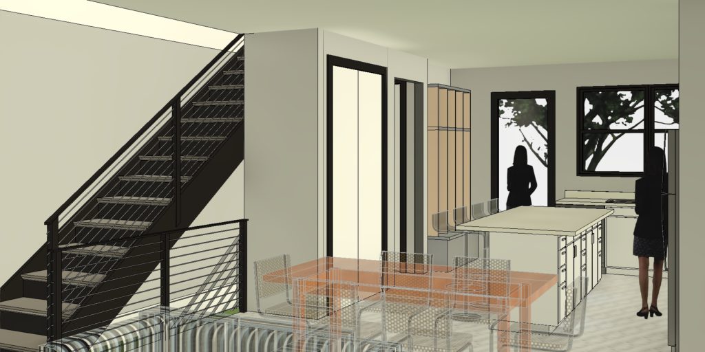
The kitchen, for example, can present a problem in an open floor plan. To solve this we placed a small screen wall at the kitchen counter. This is opposite the front door and screens the messy areas of the kitchen from a visitor’s view. However, the kitchen is still open to the dining area and living room from the resident’s perspective.

The pantry is conveniently located near the kitchen island. It’s also another screen. This primarily screens the powder room. Another approach we take is to set the stairs to the upper level diagonally from the front door. This creates a focal point for guests at the front door. Which draws their eye away from the kitchen. We also placed ample windows at the front and back for views. Not to mention, ample natural light. We placed windows on the sides with higher sills. This lets in light while providing side-yard privacy.
Keep reading and follow us on Instagram!

