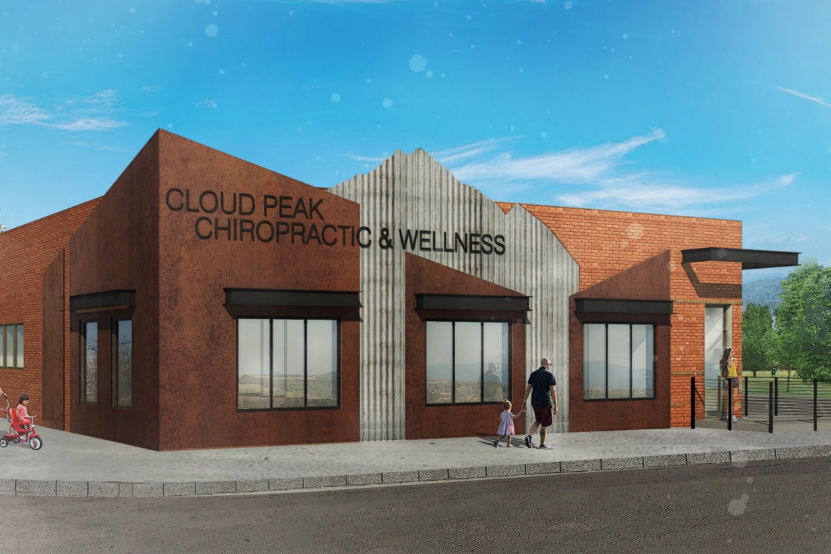
A good childhood friend of my purchased a building in Worland, Wyoming and is currently updating it for his wife’s chiropractic practice. Part of the building has some infill brick in an off color. It also isn’t very well organized since it was a purely practical response to the previous owner’s needs. So my friend’s wife (Sarah) asked me to develop an exterior elevation scheme that would make the building nice. She send some photos of buildings in town that she liked and asked for something in that vein.
In true MUES fashion we put together a concept that responded to our client’s vision. However, we also like to present ideas that may not have been considered.
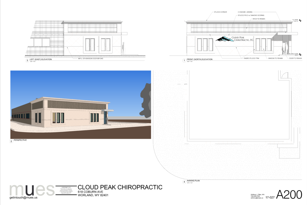
This first concept relates to the original design concept provided by our client. It is a very simple and safe design for a small town.
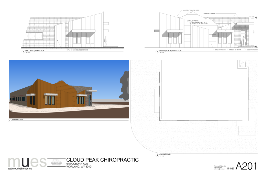
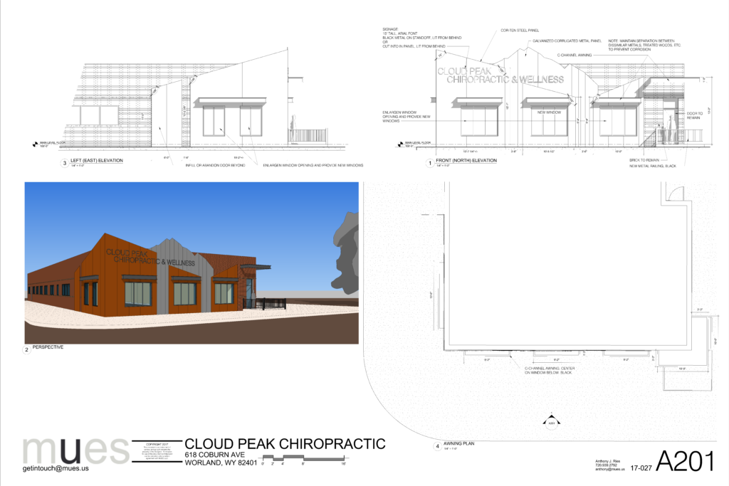
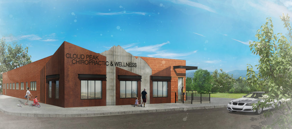
Since Wyoming is a rustic part of the country we opted to develop a theme using COR-TEN steel. Part of that theme is also to reference the mountain which is the basis of the office’s name and branding.
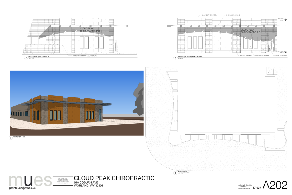
The third theme is a bit more whimsical. We designed a spine themed awning for the facade which also uses COR-TEN steel panels. Here the panels are simple rectangles so as to not compete with the awning. This scheme was more of a brainstorming session to develop unique ideas.
Ultimately Sarah fell in love with the 2nd scheme because it not only solved her original design problem but did in an attractive way that really will make her business stand out in town. We collaborated on some revisions and came up with a final design concept which her contractor is building.
We are delighted to assist with well considered projects both large and small. Get in touch however you like and lets see what we can make together.
