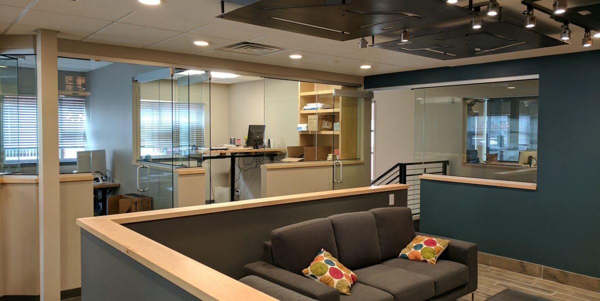
Construction is wrapping up on one of our office space layouts. We complete high quality projects which are both large and small. One of our smaller projects is the new offices for one of our high-end apartment developer clients. They recently purchased an older building in Denver and approached us for the design of the interior layout.
The existing space consisted of open work space on the perimeter and enclosed space at the interior. This created a nice working space though the interior was dark and cut off from the rest. We flipped that concept on it’s head and enclosed, in a novel way, the perimeter and opened up the middle.
The result is a light filled working space with a central hangout and collaboration space. This reflects the fast paced and collaborate work ethic of the client. The east and south walls have considerable glass so we used that to our advantage. The perimeter offices have some solid walls for privacy to adjacent spaces as well as to provide space for whiteboards and pictures. The balance of the dividing walls are glass from 42″ up to the ceiling. This bathes the interior space in ample light and creates a very open feel.

We also revised the garden level portion of the office in a similar manner. That level has light filled offices, a conference room and hangout space. Despite being partially below grade the space is fantastically lit by natural light. Effective use of natural light is part of our core design principals.

